
Coffee shop and restaurant branding: creating a place people come back to
What a hospitality brand is made of: concept, name, identity, interior, menu, takeaway packaging and Instagram. A practical guide for Tashkent venues.
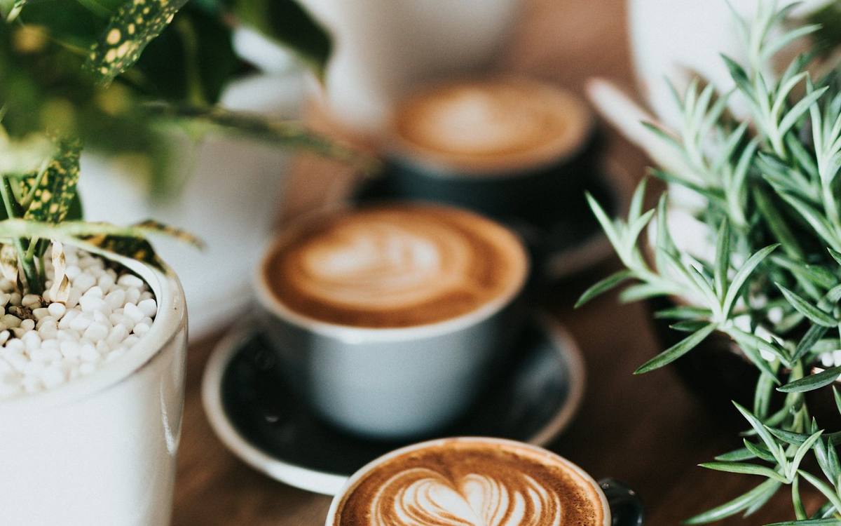
Branding a coffee shop or restaurant is not just a logo on the sign — it is the guest's whole experience: what they see from the street, how the name sounds, what the menu says, which cup they carry away and how the place looks in their stories. A strong hospitality brand makes a venue recognisable and turns a casual visitor into a regular.
Concept before logo
Before drawing a mark, answer three questions:
- Who is the venue for? Students with laptops, office workers on the go, families at weekends, guests celebrating occasions.
- What is the visit scenario? One-minute coffee to go, a long breakfast, dinner with a business partner.
- What makes you different? Your own roasting, an author menu, national cuisine presented in a new way, the atmosphere.
The answers shape everything, from wall colour to menu typeface. A grab-and-go coffee bar and a restaurant for long dinners can't look the same, even if the owner likes one particular style.
Name and logo
The name must be easy for guests, couriers and taxi drivers to say, sound good in Russian and Uzbek, and not clash with neighbours in the district. In hospitality a logo lives on very different surfaces — from a huge sign to a tiny sticker on a cup lid — so you need a system: a primary mark, a simplified version and a monogram or symbol.
Where guests meet the brand
- Facade and sign. The first touch. The sign should be readable from across the street and from a car.
- Interior. Materials, light, colour and the "photogenic spot" guests shoot and post.
- Menu. The venue's main sales document. Structure and legibility are covered in our article on menu design.
- Takeaway and delivery packaging. Cups, kraft bags, boxes, stickers — the brand your guests carry around the city.
- Uniforms and small things. Aprons, badges, napkins, receipts, loyalty cards.
- Instagram and Telegram. A consistent photo style and templates, clear navigation for menu and offers.
Guests don't come back for the logo — they come back for a feeling. Branding's job is to make that feeling repeatable at every touchpoint, from the sign to the takeaway cup.
How the brand affects the average bill
A well-thought-out venue brand works not only for recognition but for revenue:
- Price positioning. A coherent, tidy style lets you charge above the local average — guests understand what they're paying for.
- Menu structure. Highlighted signature items, clear combos and well-presented add-ons influence what guests order.
- Merch and souvenirs. Branded beans, travel mugs and postcards bring extra income and advertising at once — but only if people want to take the brand home.
- Repeat visits. Loyalty cards and a Telegram programme work better when they look like part of the brand rather than a stock template.
A brand guests want to photograph
For coffee shops and restaurants in Tashkent, Instagram and Telegram are among the main acquisition channels. Guests give you free advertising when they photograph the interior, the plating and the packaging. So it helps to design "photo moments" in advance: a recognisable wall or interior detail, a beautiful serve of your signature drink, a cup with a memorable pattern. Make sure the brand — name or mark — is visible in those shots, or guests will just be advertising "a cute place". How to turn this into systematic content is covered in our article on SMM for business.
Coffee shop, restaurant, delivery: different jobs for the brand
Coffee shop
What matters most is instant recognition and ritual. Guests often drop in for a couple of minutes, so the brand must read at a glance: a visible sign, a simple menu above the counter, a recognisable cup. Small repeated details work well — a signature sticker, a stamp on the kraft bag, a loyalty card people actually want to fill.
Restaurant
Here guests spend an hour or more, and the brand unfolds more deeply: through the interior, lighting, tableware, plating, menu copy and how the waiters behave. The atmosphere must match the price and the cuisine: a formal dining room with cheap plastic menus feels off, and so does the reverse.
Delivery and takeaway
If a large share of sales comes through delivery, guests may never see the dining room. Then the brand lives in the aggregator listing, food photos, packaging and the insert in the bag. Packaging has to protect the food, survive the journey and still be recognisable when it's opened at home or in the office.
Example: how a brand comes together in a small coffee shop
A hypothetical case: a small coffee shop by a metro exit, with most traffic being people on their way to work. The key idea is "good coffee that doesn't keep you waiting". The decisions follow from it: a short, memorable name, a large readable sign, a menu of a few items with clear sizes, pre-ordering through a Telegram bot, and a cup with one bright detail that's easy to spot in a passer-by's hand. There's no need for a complex interior or a long menu — the brand wins through clarity and speed.
Common mistakes
- Copying trendy venues. Yet another "Scandinavian" coffee shop with a neon sign quickly gets lost among look-alikes.
- Ignoring production budgets. Complex five-colour printing on every cup sharply raises unit costs. A good designer accounts for print runs and technologies.
- Different styles in the venue and on social. Guests should recognise you both in their feed and on the street.
- An unreadable menu. Small decorative type and weak contrast in dim lighting frustrate guests.
- A name nobody can find. If guests can't type the name into search or maps after hearing it from a friend, the venue loses its cheapest advertising — word of mouth.
If you run a chain or franchise
With several locations a brand book becomes essential: logo rules, palette, photo standards, menu and signage templates. Without it every new location drifts a little, and within a year the chain looks like a collection of different cafes. What such a document includes is explained in our article on the brand book.
What order to do things in
To avoid redoing expensive things, sequence matters:
- Concept and positioning — before choosing the premises or right after, so you know whether they suit the visit scenario.
- Name and identity — before the fit-out starts: the interior designer should work with the brand's palette and character.
- Sign and facade — allowing time for approvals.
- Menu, packaging, uniforms — in parallel with the fit-out, so production is ready for opening.
- Social media — launched a few weeks before opening to show the process and build a first audience.
When the brand arrives after the fit-out, it has to be stretched over a finished interior, and it never quite feels whole.
How to tell whether the brand is working
A few months after opening, it's worth answering a few simple questions honestly:
- Do guests call the venue by its name, or say "that coffee shop on the corner"?
- Do people tag the venue in their stories without being asked?
- Do friends and people from nearby offices recognise your cup or bag on the street?
- Can your baristas and waiters explain in a few words what makes you different?
If the answers are mostly no, the problem is usually not the logo but a weak concept or inconsistent use of the style.
Venue brand checklist
- Audience, visit scenario and point of difference are described.
- The name is checked for pronunciation and uniqueness in the area.
- A logo system exists for large and small surfaces.
- Menu, takeaway packaging and uniforms are designed.
- Interior and social media styles match.
- Printed items are planned around real print runs and budget.
If you are opening a coffee shop or restaurant, the Dasta Creative team can develop your venue brand together with the menu and packaging, so everything feels like one whole.

Author
Feruzbek Otaqulov
Founder of Dasta Creative
I help companies and public organisations in Uzbekistan build brands, websites and digital products, and adopt AI safely. I share my experience on LinkedIn.
Frequently asked questions
It depends on scope: a logo and style are faster, while a full package with menu, packaging and signage takes longer. Start a few months before opening to leave time for production.
Concept, name, logo, palette and typefaces, plus touchpoints: signage, menu, takeaway packaging, uniforms and social media templates.
Start from the concept and audience. The name should be easy to say in Russian and Uzbek, differ from neighbours and be available on Instagram and Telegram.
Yes, if you sell takeaway: the cup is your most mobile advertising surface. Adapt the design to your print budget and volumes.


